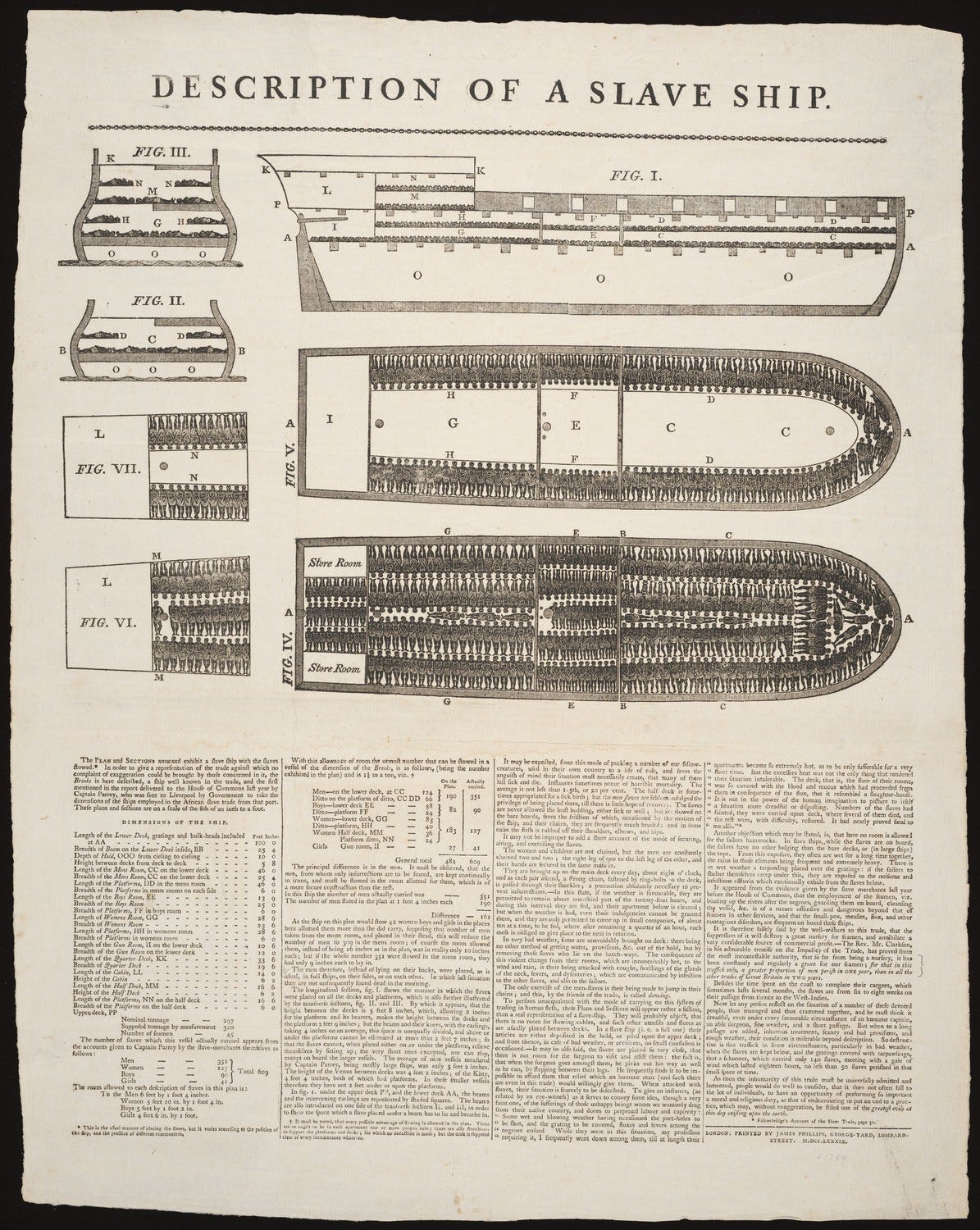
A reduction in complexity is a reduction in humanity
Lauren Klein's counterhistory of visualization addresses its inevitable and intrinsic contradictions, its dark past, and its (possible) bright future.
In the past few days I’ve been reading the manuscript of the book Data by Design: A Counterhistory of Data Visualization 1789-1900, by Lauren Klein and her many collaborators. You may remember Lauren as the co-author of the foundational Data Feminism, along with Catherine D’Ignazio, who has a new book herself, Counting Feminicide: Data Feminism in Action (also recommended!)
A while back, Lauren kindly asked me to be part of the advisory board for Data by Design and for the beautifully crafted interactive project that it emerges from; there you can find the draft of all chapters.

Anyway, I can’t write a lot about Data by Design yet—I haven’t finished reading it, after all—but I foresee that, like Data Feminism and D’Ignazio’s Counting Feminicide, it’ll change the conversation about visualization.
Lauren challenges simplistic and sanitized histories of data visualization, chockablock with heroic figures who allegedly used empirical evidence to bring humanity to a new era of progress and enlightenment. If you think that this characterization is hyperbole, please read a few popular science articles about the work of, say, William Playfair, Florence Nightingale, John Snow, and other big names in our field—or this article that I wrote years ago about why we should be wary of heroes.
Lauren undermines the very foundations of this type of narrative. She links the history of data visualization to the ugly histories of statistics, slavery, eugenics, and other contemporary maladies. She also warns against what Donna Haraway called “the god trick”, the delusion that science and its tools (data and visualization among them) can provide an entirely accurate view from above (the “god” part) and a neutral view from nowhere (the “trick” part; all views come from someone and somewhere.) For more information about the trick, read BBC News Labs’s Miranda Marcus’s introduction; it contains links to many other resources.
This said, Data by Design adopts a positive tone towards the end of each chapter. Visualization is a powerful and useful tool; when correctly used, it can reveal unseen and unexpected realities. By learning about its history, and by reflecting on how to adjust our work to avoid perpetuating inequalities and injustices, we might be able to do a bit better.
Data by Design also contains plenty of memorable passages. When discussing the necessary abstraction, aggregation, and simplification involved in the design of any visualization, and that can lead to serious misunderstandings, I found a sentence that I’ve paraphrased and jotted down on a notebook as “a reduction in complexity is a reduction in humanity.” That’s a great mantra.


Thanks Alberto.
I'd consider: “a reduction in complexity *can* be a reduction in humanity" (do you think it is always so?)
as well as "a reduction in complexity is a door for novices to enter and appreciate more complex realms."
What's your take on these observations?