How visualization reveals implicit prejudices
—in this case, against trans and nonbinary people.
Among the many benefits of data visualization—an unsung one—is its power to reveal, and then either strengthen or undermine, implicit prejudices.
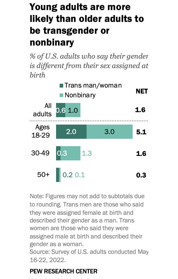
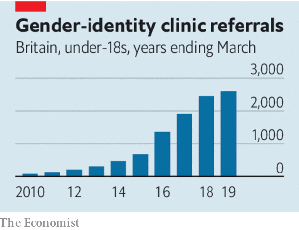
Please take a quick look at the following charts. Examine your immediate feelings about them, and your first hunch of what they depict:


If you’re like me, the first thought that might cross your mind about the first chart is “people in younger generations seem to feel more comfortable expressing who they are.” My reaction to the second one was “great, the closer we get to the present, the more people are being referred to care they may need.”
A follow-up thought could be: we should pay attention not to the increase in clinic referrals (which is very small, and hardly an “explosion”, as some uninformed pundits have called it,) but to the people not counted in the chart, those who could benefit from this type of care but can’t access it—in the U.S., often because they’ve been deprived of the right to obtain it.
If your snap reaction to either of these charts is one of shock, alarm, or even disgust (“kids these days—what’s wrong with the world?”), it’s likely that you have an implicit prejudice against people unwilling to conform to what you believe are sexual and gender correct standards. Perhaps you should meditate about it.
About the second chart, I bet that negative reactions to it are common among reporters and editors in mainstream news publications, particularly The New York Times, The Guardian, The Atlantic, and The Economist. That’s my guess based on their contributions to fuel a mass hysteria about trans youth and gender affirming care, which eerily replicates the language of past moral panics about the gay community. We journalists aren’t good at learning from our own dark recent history.
Behind all the breathless, flawed, biased, ignorant, and statistically unrepresentative mainstream coverage of trans matters lies a series of prejudices that everyone in the aforementioned newspapers and magazines will deny holding (“how do you dare saying that about me? I’m an open-minded person!”): That being gender nonconforming—more specifically transgender—is not normal, that it’s something no one should desire, and that it can be contagious (I don’t think so.)
I’m convinced that without these interconnected implicit prejudices—which, again, may be revealed by having people look at the charts above, and then quickly say what they think about them—we wouldn’t witness such an obsessive focus on this topic in mainstream news.
How obsessive, you might wonder? According to some counts, The New York Times devoted more than 25,000 words to gender affirming care in eight months of 2023 alone, most of it within long, page one stories. In my opinion, most of this coverage doesn’t meet elementary reporting standards.
Of course, these underlying prejudices are nonsense. Gender nonconforming people are as normal—in the everyday sense of that word—as cisgender, gay, or heterosexual people. They aren’t typical (after all, this is a tiny minority who’s enduring an organized hatred campaign) but none of us is typical in one way or another, aren’t we? Why should being atypical in terms of gender or sexuality be different than being atypical in terms of other physical or psychological traits? It’s not. It’s just one among many expressions of the immense diversity of the human experience, which we are still unearthing.
In relation to all this, in the past couple of years I’ve been thinking a lot about the origins and genealogy of modern notions of normality and normativity, and about their connection to prejudice and hate. I’d love to write more about it in the future, as I think that it’s something that many journalists and visualization designers are oblivious to.
As it usually happens when an idea takes over my brain, I haven’t been able to stop reading about it for months. I fell into a rabbit hole first by revisiting Data Feminism (its authors, Catherine D’Ignazio and Lauren Klein, are launching new books soon, and they look excellent,) and Lewis Raven Wallace’s book and podcast The View From Somewhere. I’ve also given a second look at the histories of statistical thinking that I have on my shelves, such as Stephen Stigler’s, Peter Bernstein’s, or Ian Hacking’s.
Among the latest books I’ve read, I wholeheartedly recommend Normality: A Critical Genealogy (Peter Cryle y Elizabeth Stephens,) From Disgust to Humanity (Martha Nussbaum,) and Empire of Normality (Robert Chapman.)
Perhaps all this work will coalesce into a new book by me. Time will tell.
(I leave you with some music that evokes good memories: Black Sabbath are about to release remastered versions of a handful of undeservedly forgotten albums. The most iconic song in them, I’d argue, is the thunderous Headless Cross):


Your examples make me think once again about an important aspect of data visualization we do not talk enough about: data, no matter how accurate or representative, always require interpretation. We bring our own mental models to the equation. As your example explains, the exact same information can lead people to very different conclusions. Scientists, when they do their work right, do their best to dissect and refute the realities their minds construct from data, often by crafting clever follow-up experiments. But we as a society are very far from that. We do not even seem to promote that kind of self-skepticism/humility.