Visualization as a shared revealing experience
Learning objectives and persuasive charts to use in court

It feels wonderful when several ongoing projects end up feeding into each other. In the past few weeks I’ve been (a) part of Elsie J. Lee-Robbins’s PhD dissertation defense committee, (b) designing graphics for a law firm I often collaborate with, (c) revamping my corporate workshops and university classes.
Learning objectives, cognitive and affective
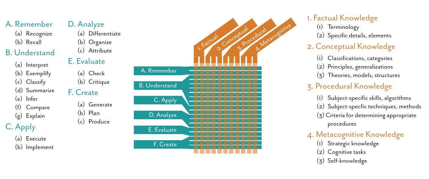
Elsie’s PhD dissertation is an expansion of several award-winning papers about learning objectives in visualization. As we all know by now, visualization can be used for exploration, analysis, communication, artistic expression, and other purposes; according to Elsie, when a visualization is communicative, it can be conceptualized as a teaching experience, with the designer acting as a teacher and the reader being imagined as a student.
If we adopt that framework, there’s much to be learned from scholarly literature on education. Designers, emulating educators, can rigorously describe their educational intent—the purpose of their visualization—by writing one or more learning objectives with the following format:
The viewer will [verb] [noun]
In this sentence, the verb is a cognitive action—recall, summarize, infer, etc.—and the noun is whatever it is that the visualization is designed to convey. This may sound a bit obvious but, despite my instinctual anarchic leanings, which I discussed in The Art of Insight, I believe that there’s value in clearly and systematically listing the learning objectives of a communicative visualization; for instance, that list can be used to assess and test its effectiveness. In other words, whether outcomes match intent.
(You can find much more details about this, including lists of verbs and nouns for cognitive and affective learning objectives, in Elsie’s papers.)
Visualizing for a jury
In the days when I was re-reading Elsie’s dissertation, I was also creating several visuals (“demonstratives”) for a law firm I’ve been working with for nearly a decade. While doing so, I found myself vaguely envisioning learning objectives—both cognitive and affective—and letting them guide my design choices.
Here’s the case in broad strokes: Take two companies, Company A —our client; the one suing—and Company B—the one being sued.
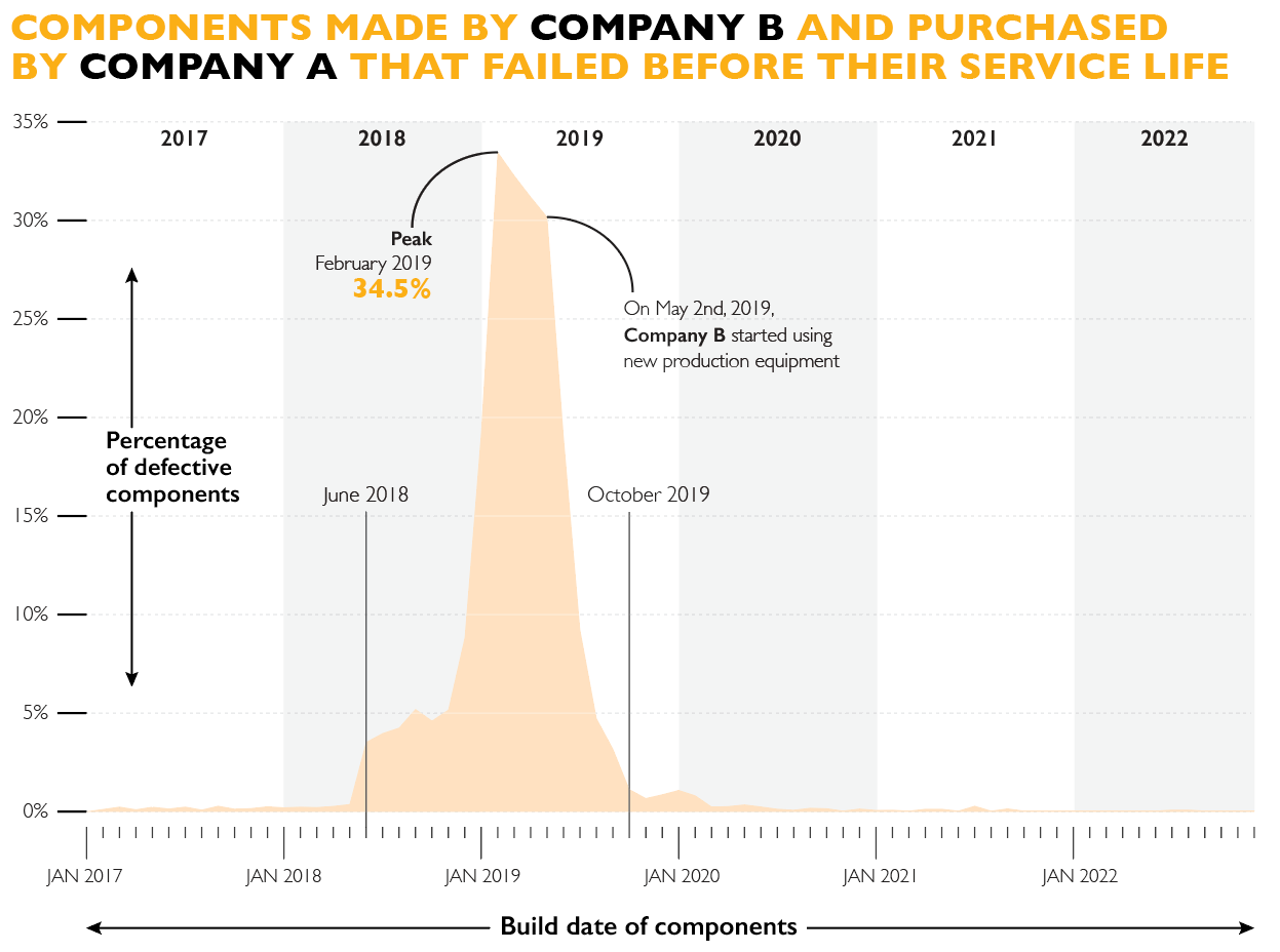
Beginning in January of 2017, Company B manufactured certain components for products (machinery) produced by Company A. For a while, fewer than 0.5% of these components were defective.
Between mid-2018 and early 2019, a substantial percentage of components—up to more than one third in February of 2019—made by Company B began failing, making an equal rate of Company A’s machinery fail, as well.
Our client, Company A, obtained tentative evidence suggesting that, at least since June 2018, there was a defect in the equipment that Company B was using to produce the components.
Company B denied this defect in its production equipment. They blamed our client, arguing, among other things, that it wasn’t assembling the components correctly. However, without telling Company A, Company B purchased new production equipment, which was put in use in May of 2019.
After the new production equipment was in place, the percentage of defective components dropped sharply, eventually going back to fewer than 0.5%.
Now read the following graph and imagine that the argument in court were made without its support; would it have been persuasive? This is an example of why Edward Tufte has referred to visualizations as displays of evidence (note: I’ve changed all details and data):
With this chart I wanted to show, above anything else, the facts in a clear and accurate manner, but there were also cognitive intents involved: to help the jury recall (once you see that sharp peak and the precipitous decrease a few months later, it’s hard to forget them,) infer, and compare (before-during-after,) among other objectives.
As for affective goals, the rhetorical, persuasive intent of this chart should be obvious; those textual annotations are there for a reason. A chart alone can’t prove causality, but it can help corroborate it in an additive manner, paired with other evidence, visual or otherwise. This chart makes you feel that there was something odd going on between June of 2018 and October of 2019. There was indeed.
Our side won the case.
A shared experience
I designed many other graphics for this case, detailing much more evidence; they were all discussed in a focus group before trial, but the one above was always a favorite among participants. A common response to it was that all other evidence made our attorneys’ narrative convincing, but that seeing and recalling this chart made it overwhelmingly so. Therefore, our attorneys displayed it several times during the hearing.
This project got me thinking about communicative visualization as a shared experience of revelation. When our side’s attorneys and I were creating the first version of these graphics—crude Excel designs,—particularly the one above, the patterns in the data were so stark that it was inevitable to think and mutter “oh, wow!” Stephen Few has a book titled after such oh-wow moments, Now You See it, which to me means “I’ve seen something. Visually representing this data within its proper context revealed it to me. Now let me reveal it to you so we can experience it together.”
I then came up with a title for the new version of my workshops, The Revealing Art. I like it also for a future book.
What I’ve been reading
Some stuff about ethics, mostly, but also about the early Middle Ages, one of my favorite topics. I guess that most of you don’t understand Spanish, but if you do, I recommend looking into Antonio Valdecantos, particularly into his La fábrica del bien, an essay on moral philosophy that is as accessible and readable as it is stimulating and iconoclastic. Here’s a review (in Spanish).
I leave you with the soundtrack of the 2015 movie Carol, led by a magnificent Cate Blanchett:


