


Visualizing extrajudicial violence in Bangladesh
Against all odds, investigative journalists all over the world keep producing great work.


Since Twitter got broken by its deranged new owner—he transformed a once useful platform into a cesspool brimming with neonazis, transphobes, and crackpots of all stripes—those of us interested in infographics and data visualization lack a place to easily discover new great projects or research. That’s why it’s a blessing for me to be part of the jury of several international awards, such as the SIGMA, which has just announced its 2024 winners.
Judging the SIGMA awards is humbling and enriching. Even if journalism is a precarious profession that pays too little—and it seems that things won’t get better soon—journalists everywhere keep producing great visual and investigative work against all odds. Moreover, SIGMA strives to recognize projects not just by the usual suspects—U.S. or Western European big news publications—but by smaller organizations from often overlooked countries and continents.
In the next few weeks I may write about a handful of winners. To begin with, I’d like to highlight BODY COUNT: Extrajudicial Executions in Bangladesh, by Nazmul Ahasan, published by Netra News, and nonprofit watchdog publication in Bangladesh. Its central element is a searchable database of cases:
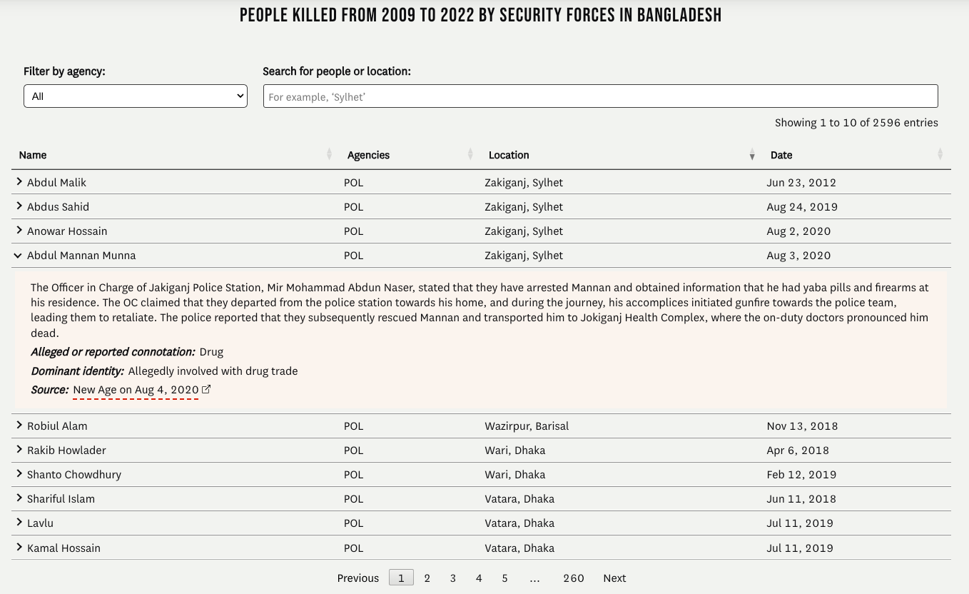
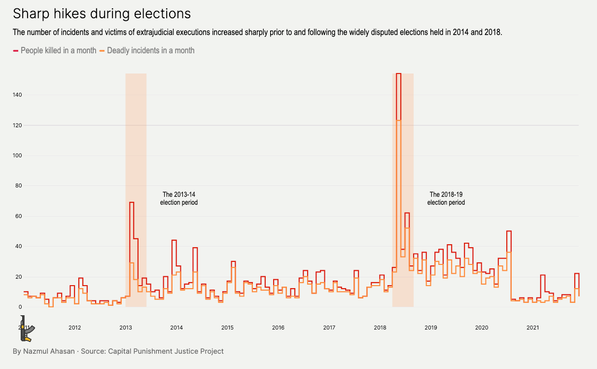
Data from human rights organizations shows that in the past 13 years, since Sheikh Hasina became prime minister of Bangladesh, the country’s security forces have become very violent: there have been more than 2,500 cases of extrajudicial killings, torture, and shootings at protestors. This type of violence increased around the 2014 and 2018 elections, as revealed by one of the many charts in the story:
Ahasan’s piece is exemplary because of its combination of a solid narrative, a detailed methodology section at the end, and a variety of elegant charts and maps—some of them shocking, such as this one showing a sharp increase of the violence against the Rohingya:

(There’s a fact that makes this piece even more impressive: Nazmul Ahasan created it as part of the work towards obtaining a MA in Journalism at UC Berkeley’s Graduate School of Journalism; he got assistance on web design and visualization by several faculty members, but still…)